Swatching Watercolours
My paint of choice, in the last few years, has been acrylics. They are easy to use, easy to mix, behave consistently on a variety of surfaces - even easy to clean up. But I have recently been reminded, in my own practice, and by an artist friend, that watercolours are what make my heart sing and my art come alive the most - so the time has come to understand what my watercolours can do and build a collection of versatile colours.
Not having done a great deal of watercolours ever, I bought a 'designer set' - good quality paints from Daniel Smith, selected by the artist Alvaro Castagnet.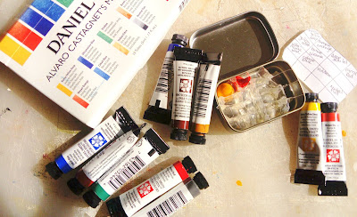
I went travelling in Europe with my children over the summer and made a tiny palette in a tin to take my Alvaro Castagnet paints with me, however, these colours suit HIS choice of colour palette, and I knew before I set off that I was missing a true greeny-green and yellowy-yellow (very technical terms in use here!), I also I wanted some other bright colours.
After spending much longer than I should have looking for other people's favourite Daniel Smith colours on youtube clips and reading blogs, I ordered some exciting sounding paints:
Yellow Gamboge, Amazonite Genuine, Green Gold, Opera Pink and Rose of Ultra Marine.
Sadly, only the opera pink and rose of ultra marine arrived in time for me to squeeze them into my newly created tiny travelling palette before setting off on my travels...
I struggled, when I was away, to make lovely greens - so I either used my inktense pencils, or waited until I returned to complete some of my sketches.
On my return I couldn't wait to add my other colours to my palette. But when I did, I was concerned that I hadn't made the best choices to complement the paints in my existing set: the Amazonite genuine was not as blue as I was expecting, and was the new yellow was just as orangey as the Hansa yellow deep?
To chack, and to see the range of colours available to me, I decided to make a big old grid to swatch the colours. The plan:
It clearly shows that my two yellows are too similar, and found that the Amazonite as well as not being as blue as I wanted, was actually very similar to Viridian.
There was only one option available to me - more online shopping!

I did a very sensible thing this time, and dug out a sample sheet with dots of all the Daniel Smith colours (Why didn't I do this before?). I went for Cadmium Yellow Light and Permanent Green: they seem to be close to primary colours, and should mix well with other colours. For the bright blue I chose Maganese Blue Hue - light, crisp and bright (I was tempted to get a turquoise but talked myself round) I'm happy with this blue.
So, yellow gamboge has been ousted, as has one of the greens. I chose viridian (who could ditch something as exotic sounding as Amazonite?)
And then I bought one more colour - I couldn't resist Moon Glow. It's a dark, mysterious, purplely shade and appears to be a bit of favourite amongst people who already own it. to accommodate it in my palette I had to divide a section in two (I used sellotape - I was being impatient, what can I say?). There's not really room for it on my swatch page either, but I'm very happy to have it in my collection.I added my new colours to my swatch page (covering the unwanted ones) and made a quick video of the result. Now I can see all the colours available to me and can't wait to use this new and improved swatch as a reference for some new art!
Not having done a great deal of watercolours ever, I bought a 'designer set' - good quality paints from Daniel Smith, selected by the artist Alvaro Castagnet.
After spending much longer than I should have looking for other people's favourite Daniel Smith colours on youtube clips and reading blogs, I ordered some exciting sounding paints:
Yellow Gamboge, Amazonite Genuine, Green Gold, Opera Pink and Rose of Ultra Marine.
Sadly, only the opera pink and rose of ultra marine arrived in time for me to squeeze them into my newly created tiny travelling palette before setting off on my travels...

I struggled, when I was away, to make lovely greens - so I either used my inktense pencils, or waited until I returned to complete some of my sketches.
On my return I couldn't wait to add my other colours to my palette. But when I did, I was concerned that I hadn't made the best choices to complement the paints in my existing set: the Amazonite genuine was not as blue as I was expecting, and was the new yellow was just as orangey as the Hansa yellow deep?
To chack, and to see the range of colours available to me, I decided to make a big old grid to swatch the colours. The plan:
- to mix pairs of colours on the top triangle. I mixed them, wet in wet, on the paper to see how they worked together as well as seeing the colours created
- to layer one paint over another colour which was already dry - creating a glaze.
(TBH, I kept forgetting my plan and the glazes are a bit higgledy-piggedy)
It clearly shows that my two yellows are too similar, and found that the Amazonite as well as not being as blue as I wanted, was actually very similar to Viridian.
There was only one option available to me - more online shopping!

I did a very sensible thing this time, and dug out a sample sheet with dots of all the Daniel Smith colours (Why didn't I do this before?). I went for Cadmium Yellow Light and Permanent Green: they seem to be close to primary colours, and should mix well with other colours. For the bright blue I chose Maganese Blue Hue - light, crisp and bright (I was tempted to get a turquoise but talked myself round) I'm happy with this blue.
So, yellow gamboge has been ousted, as has one of the greens. I chose viridian (who could ditch something as exotic sounding as Amazonite?)
And then I bought one more colour - I couldn't resist Moon Glow. It's a dark, mysterious, purplely shade and appears to be a bit of favourite amongst people who already own it. to accommodate it in my palette I had to divide a section in two (I used sellotape - I was being impatient, what can I say?). There's not really room for it on my swatch page either, but I'm very happy to have it in my collection.I added my new colours to my swatch page (covering the unwanted ones) and made a quick video of the result. Now I can see all the colours available to me and can't wait to use this new and improved swatch as a reference for some new art!


Comments
Post a Comment